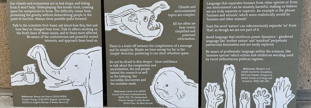
Manifesto was the first exhibition as part of the MA Illustration - Authorial Practice that I'm doing part time as professional development while also running the TTT studio. The brief was a simple one - to present anything we liked that could feasibly be considered a manifesto.
I took the opportunity to use my background in conservation biology research, and also experience from developing and running a 3rd year university module called 'Science in Society', to design a set of six prints on the topic of 'Communicating our Changing World'. Five of these took evidence from the social sciences research about how we can use images and language better when we communicate about climate and environmental issues. We often fumble about with words in particular, thinking about how to 'make people care' or 'change minds', forgetting, or perhaps unaware, that there are vast research fields out there that study exactly this (and which are used to great-but-damaging effect by the incredibly successful advertising industry). The sixth print was called 'the small print', and was more about how we work, and making our practices match the reality of climate/environmental breakdown.
This brief gave me a chance to update myself with the latest research and think more about how it can inform my own work as I morph into doing more authorial illustration projects. It gave me time to think about how we work at TTT, whether I'm still happy with our values, and how this maps onto any potential change in direction towards more illustration work. The outcome was also aimed at peers - other students, staff or studios who produce work in this area. I've copied all the text below in case it's interesting or useful for TTT readers.
One of the big reasons I wanted to take this course was to learn every new technique I possibly could, so I'm using each project to try out something new - this means we'll be able to offer more approaches for our TTT studio community and clients. This time I'd wanted to have a go at embossing, and also do battle with white printing again as I'd had some trouble with it previously.
My white printing issue was mainly getting the registration right between an initial layer of printed white ink and an overlaid layer of coloured ink - which turned out to mainly be due to the type of paper used and how thick and grippy it was for the printer, I think my thinner and more slippery paper was simply slipping as it went through the printer, resulting in layers that didn't align perfectly - a problem now solved. For the illustrations I wanted to try using the paper colour as the line, rather than printing the line itself as is more normal for illustration work - hopefully you'll see what I mean from the images below.
The embossing was more interesting - with the help of a lovely technician at the university, I exposed photopolymer plates to UV light while covered with a sheet of acetate on which we'd printed my illustrations. Any areas covered by printed black acetate were not exposed to the UV, while the other areas were and so set hard. The unexposed areas then simply wash away with water, leaving a dip in the plate wherever the black illustrated lines were on the acetate. The plates are then used with a lovely big cast iron starwheel press to emboss paper. I did a lot of experimenting with different types of paper as not everything works with this technique - you need quite spongy paper that will sink into the dips leaving a sharp finish (Fabriano velvet grey was the winner).
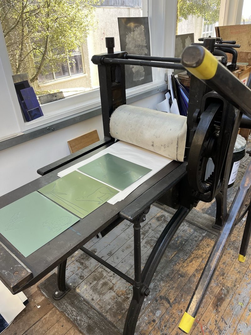
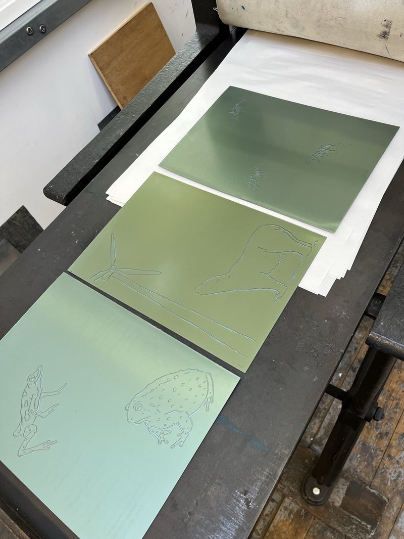
For my final 6 prints, 3 were printed on the lovely Fabriano creamy grey paper with text in a khaki green then embossed with illustrations, and 3 were printed on a GF Smith khaki green paper (matching the text on the previous prints) with a layer of white and then a layer of cream-grey (so the illustrations and text roughly matched the paper colour of the embossed prints).
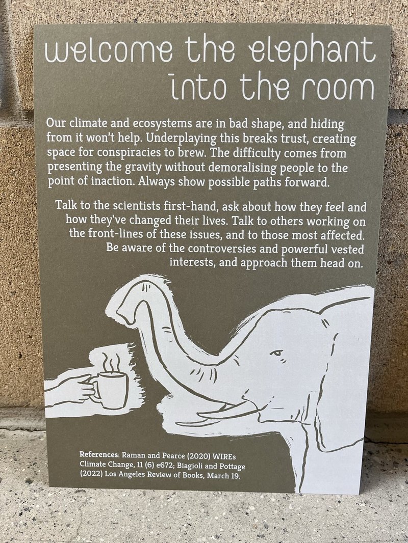
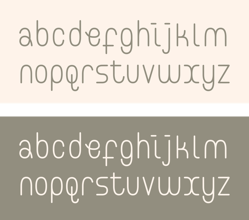
As an extra touch I designed a new typeface for the titles of each print, which in time I'll probably turn into a proper font to release for others to use (I made it as .svg files so it's all ready to go, but sorting out the kerning properly for a font file takes time and care).
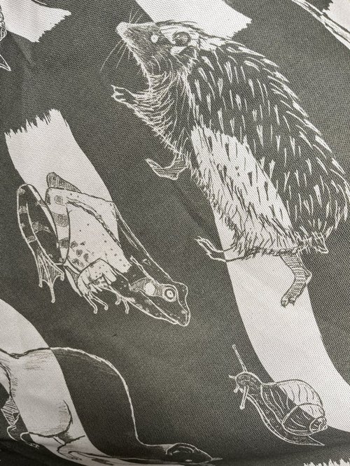
As an extra-extra touch I also digitally printed some fabric with more illustrations, matching the colours of the paper-based prints, and used this to wrap a small box containing a more personal manifesto that wasn't for public viewing - a small statement on the need to retain healthy boundaries when working on stressful issues like climate breakdown.
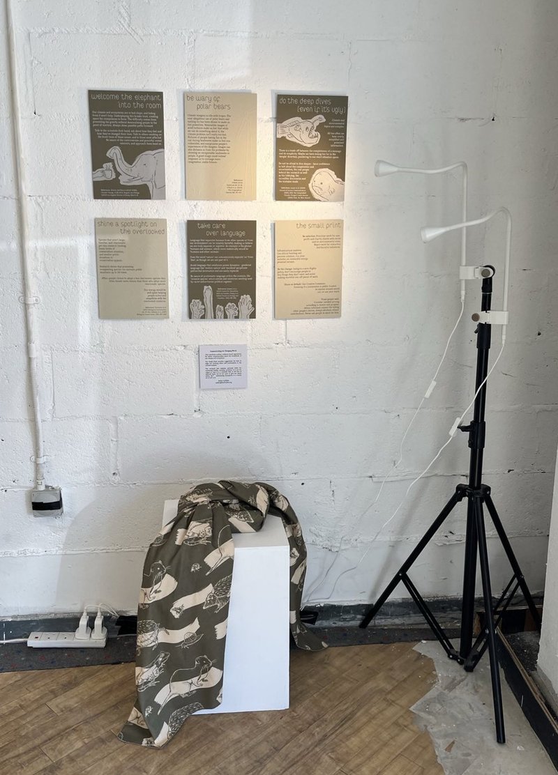
The prints and wrapped box were displayed for a few days in a manky old Argos building in Falmouth, below a skate park, alongside 39 other illustration and fine art MA projects - a glorious mishmash of different styles, topics, materials and attitudes, with a surprisingly large number of visitors from all walks of life. The prints were lit from the side with two spotlights when it came to exhibit, to make the embossing stand out by casting shadows.
If you'd like one or all of the prints, get in touch and I can make some for you.
Welcome the elephant into the room:
Our climate and ecosystems are in bad shape, and hiding from it won’t help. Underplaying this breaks trust, creating space for conspiracies to brew. The difficulty comes from presenting the gravity without demoralising people to the point of inaction. Always show possible paths forward.
Talk to the scientists first-hand, ask about how they feel and how they've changed their lives. Talk to others working on the front-lines of these issues, and to those most affected. Be aware of the controversies and powerful vested interests, and approach them head on.
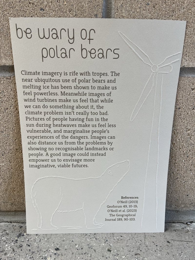
Treat polar bears with caution:
Climate imagery is rife with tropes. The near ubiquitous use of polar bears and melting ice has been shown to make us feel powerless. Meanwhile images of wind turbines make us feel that while we can do something about it, the climate problem isn’t really too bad. Pictures of people having fun in the sun during heatwaves make us feel less vulnerable, and marginalise people’s experiences of the dangers. Images can also distance us from the problems by showing no recognisable landmarks or people. A good image could instead empower us to envisage more imaginative, viable futures.
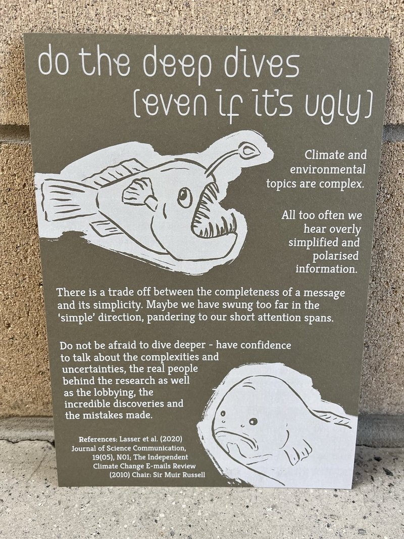
Do the deep dives (even if it's ugly):
Climate and environmental topics are complex. All too often we hear overly simplified and polarised information. There is a trade off between the completeness of a message and its simplicity. Maybe we have swung too far in the ‘simple’ direction, pandering to our short attention spans.
Do not be afraid to dive deeper - have confidence to talk about the complexities and uncertainties, the real people behind the research as well as the lobbying, the incredible discoveries and the mistakes made.
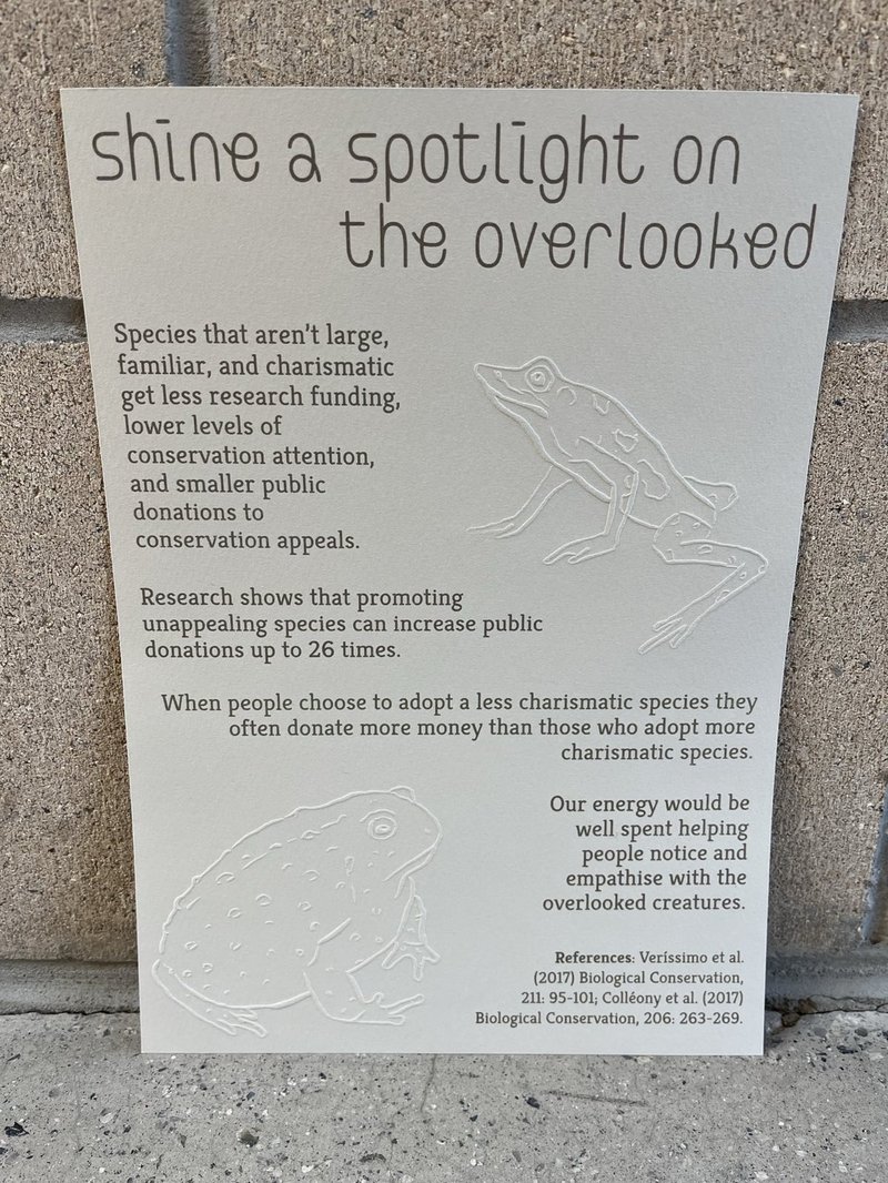
Shine a spotlight on the overlooked:
Species that aren’t large, familiar, and charismatic get less research funding, lower levels of conservation attention, and smaller public donations to conservation appeals.
Research shows that promoting unappealing species can increase public donations up to 26 times. When people choose to adopt a less charismatic species they often donate more money than those who adopt more charismatic species.
Our energy would be well spent helping people notice and empathise with the overlooked creatures.
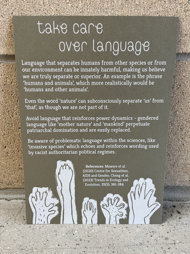
Take care over language:
Language that separates humans from other species or from our environment can be innately harmful, making us believe we are truly separate or superior. An example is the phrase ‘humans and animals’, which more realistically would be ‘humans and other animals’. Even the word ‘nature’ can subconsciously separate ‘us’ from ‘that’. Avoid language that reinforces power dynamics - gendered language like ‘mother nature’ and ‘mankind’ perpetuate patriarchal domination and are easily replaced. Be aware of problematic language within the sciences, like ‘invasive species’ which echoes and reinforces wording used by racist authoritarian political regimes.
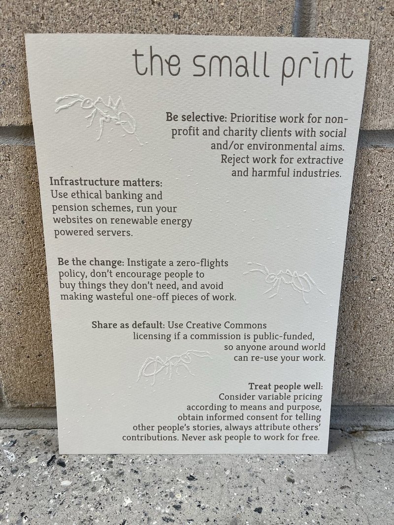
The small print:
- Be selective: Prioritise work for non-profit and charity clients with social and/or environmental aims - reject work for extractive and harmful industries.
- Infrastructure matters: Use ethical banking and pension schemes, run your websites on renewable energy powered servers.
- Be the change: Instigate a zero-flights policy, don’t encourage people to buy things they don’t need, and avoid making wasteful one-off pieces of work.
- Share as default: Use Creative Commons licensing if a commission is public-funded, so anyone around the world can re-use your work.
- Treat people well: Consider variable pricing according to means and purpose, obtain informed consent for telling other people’s stories, and always attribute others’ contributions. Never ask people to work for free.

